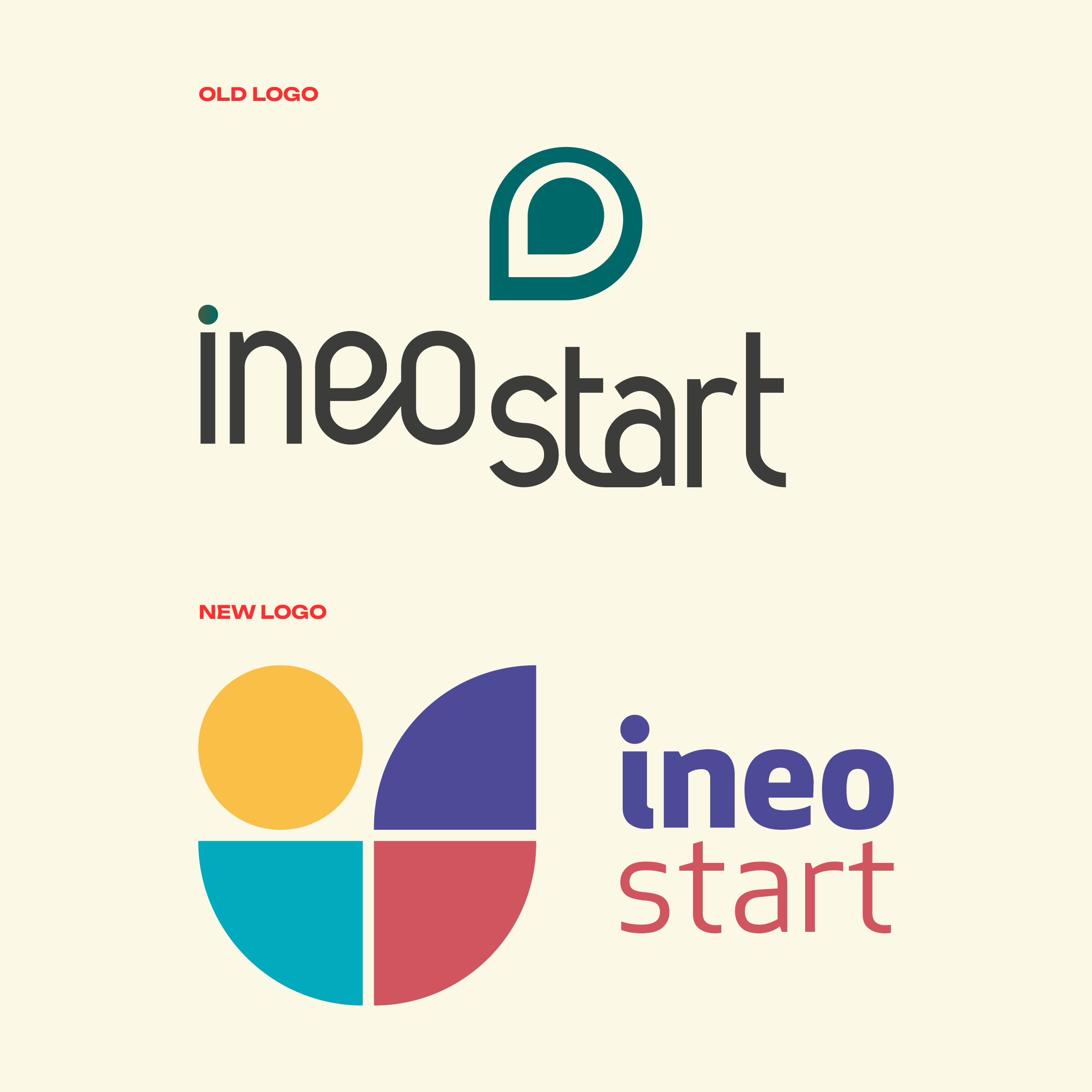
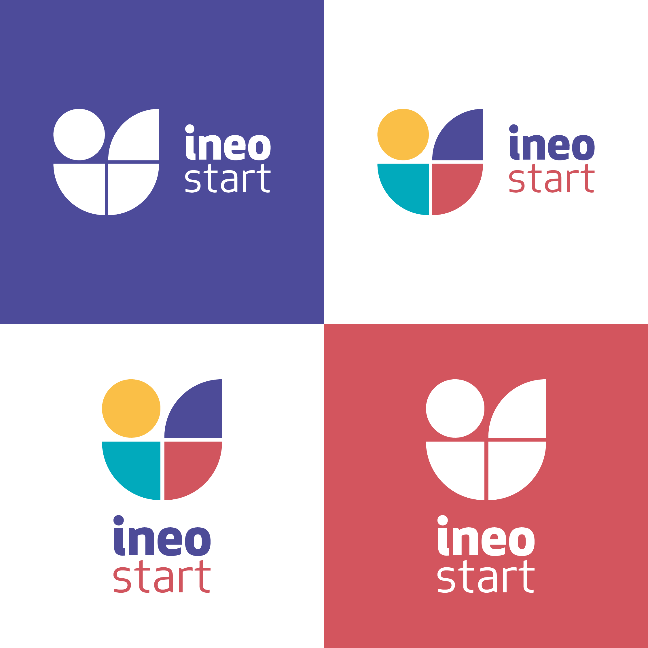
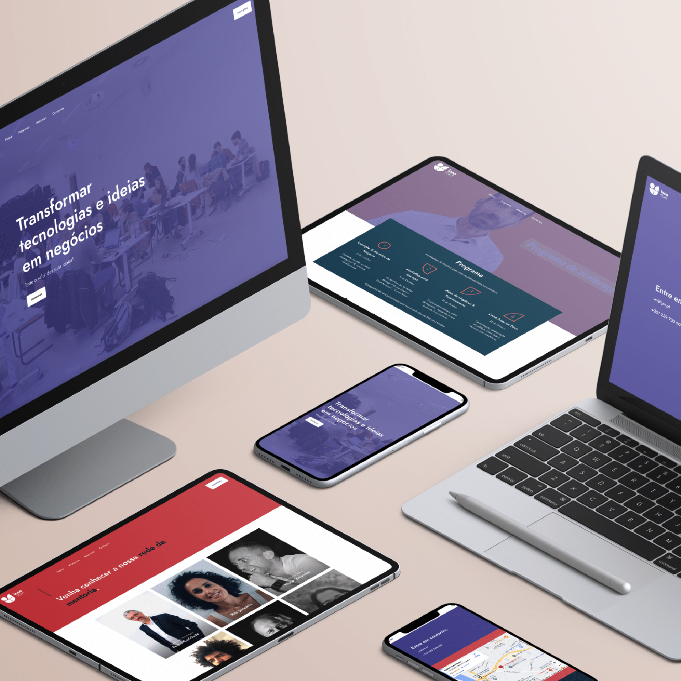
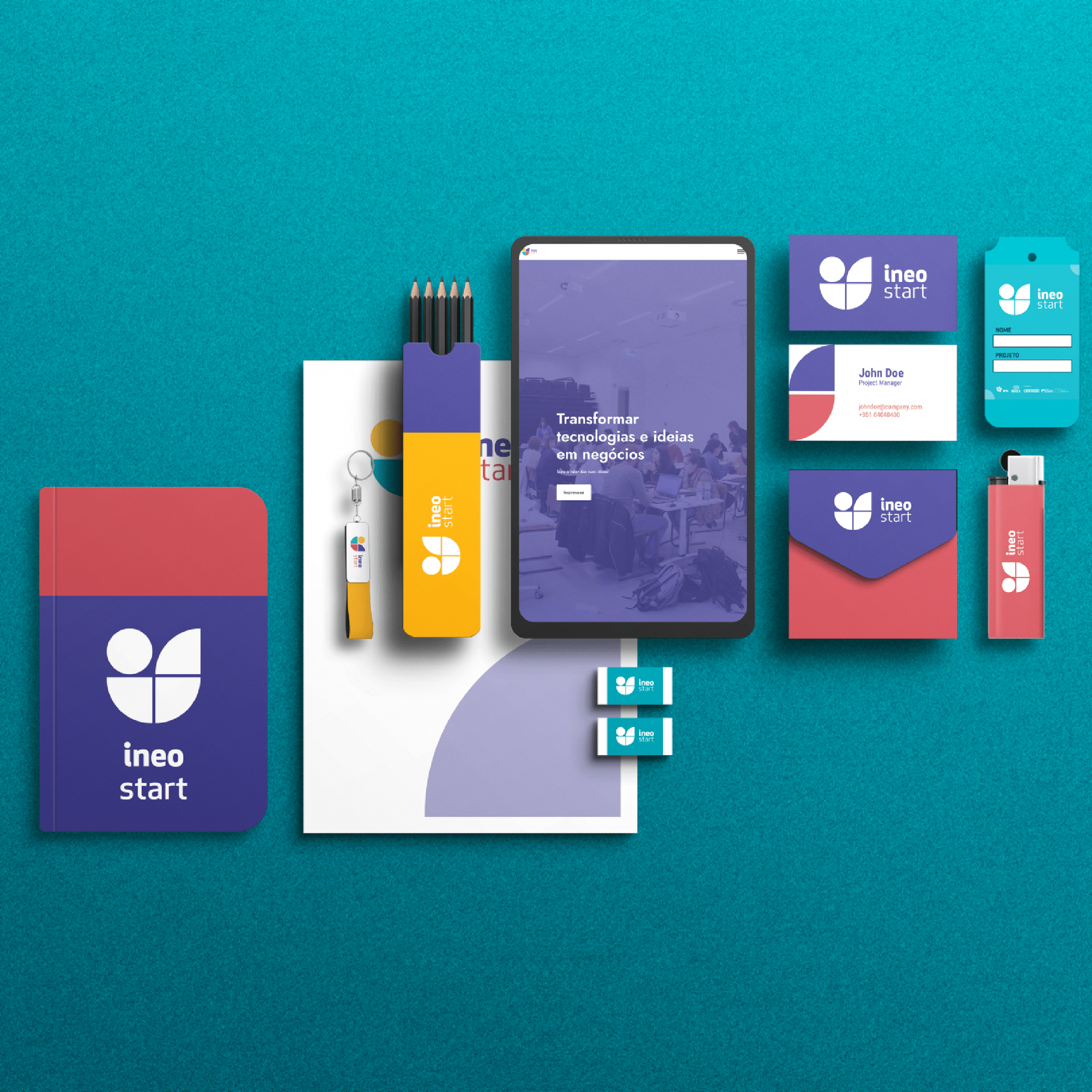
The IneoStart logo combines three concepts into a single mark: the letters ‘is’ (from IneoStart), a location pin representing place and presence, and a circular diagram symbolizing structure and organization. Together, they form a compact, modern icon that reflects the initiative’s role as a structured hub connecting people and ideas.
BRNDTS
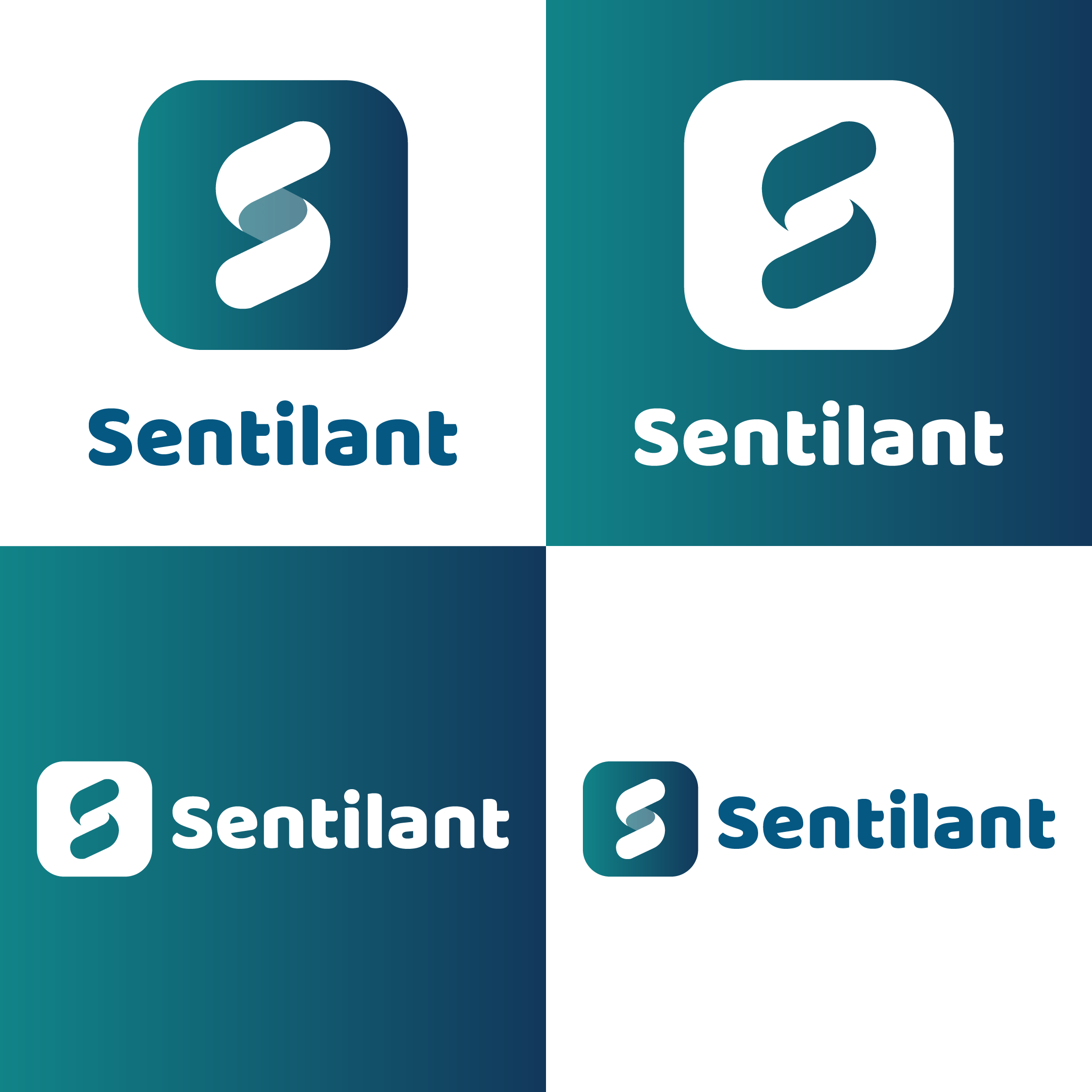
The BRNDTS icon is built from four elements representing the key players in the advertising ecosystem: ads, ad viewers, content creators, and publishers, who bring everything together on their platforms. Rotated -90° and mirrored, the icon also reveals a hidden reference to an old movie camera, a nod to the storytelling roots of advertising. The Exo typeface conveys strength and a tech-forward aesthetic, while the blue-to-green gradient reflects trust, creativity, and innovation — together forming a cohesive identity for a company at the intersection of advertising and technology.
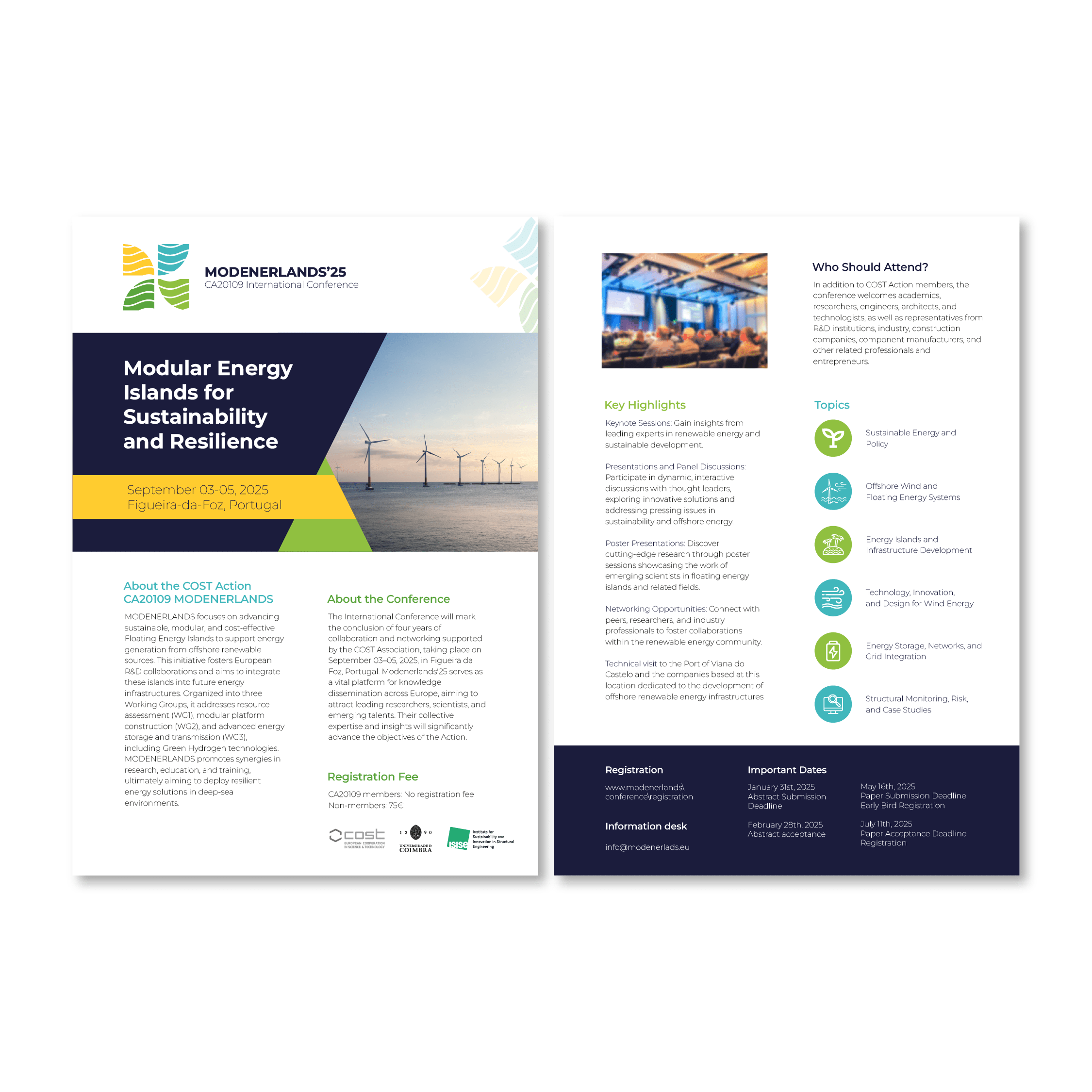
Modenerlands
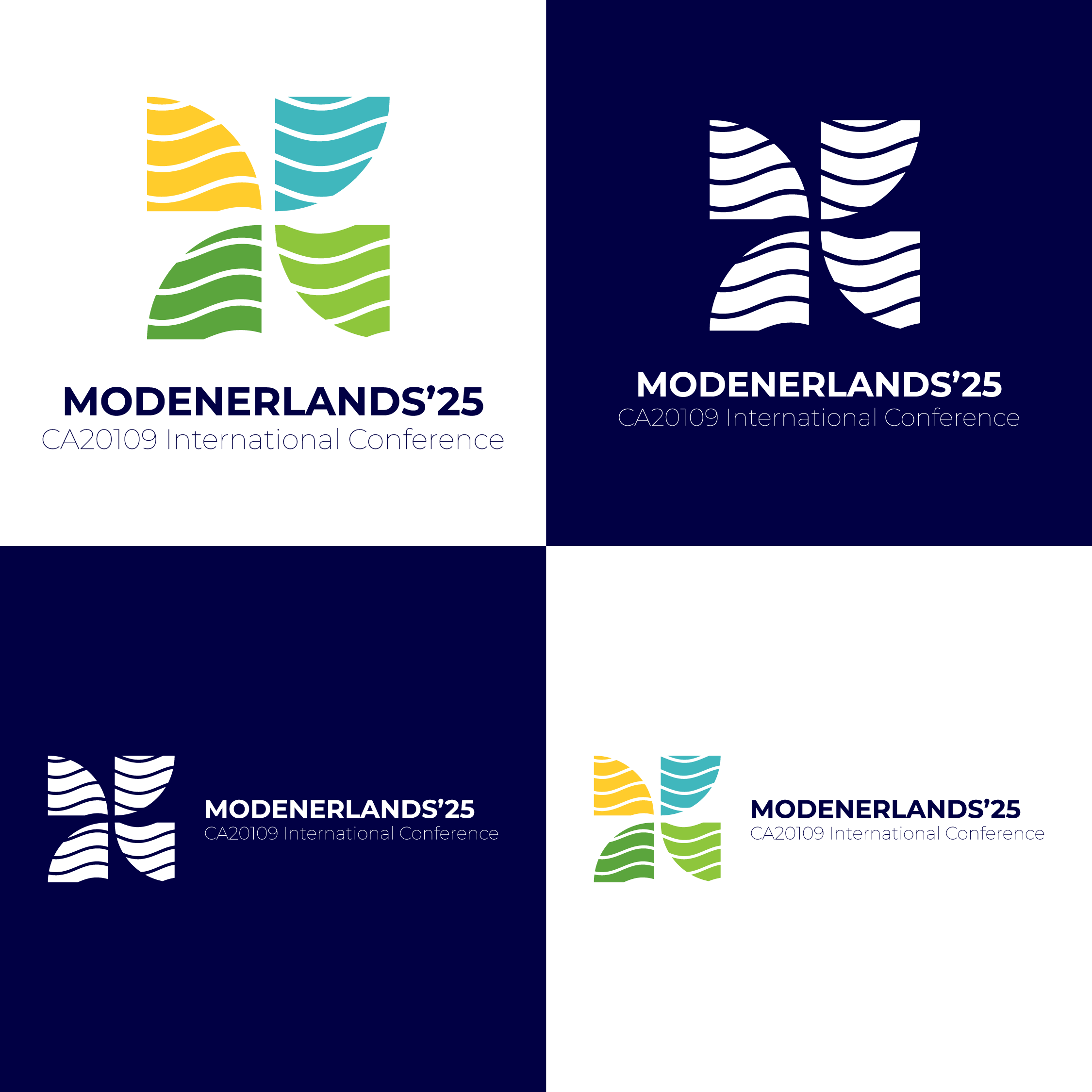
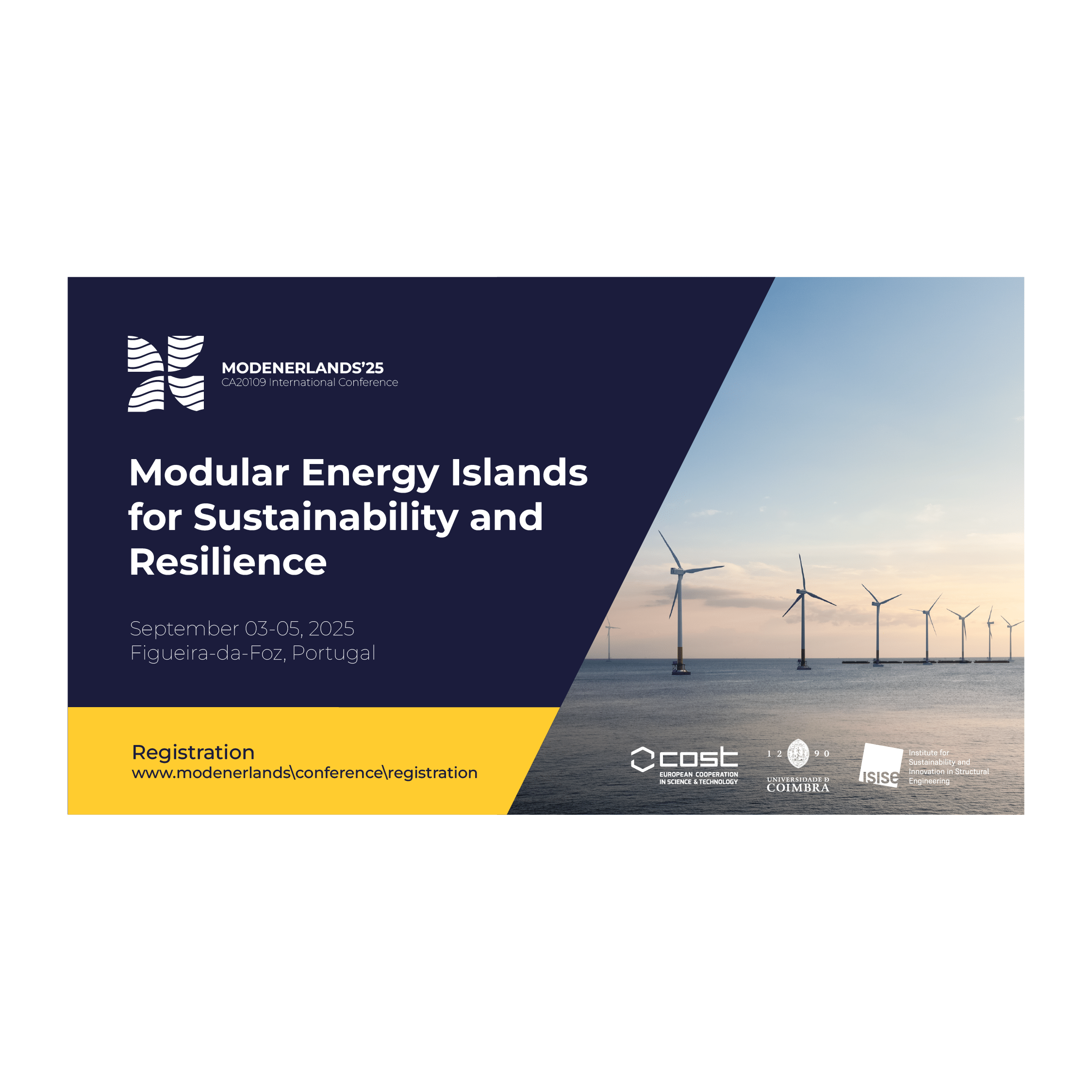
Inspired by the marine environment, this logo unites water and wind: the central droplet represents the ocean as a source of clean energy, while the negative space suggests offshore wind turbines. The flowing shapes evoke movement and continuous energy.
Let’s work together
Have a project in mind? I’d love to hear your ideas and create something meaningful together. Let’s bring your vision to life.
fardilha.luis@gmail.com
Cookie Consent
We use cookies to improve your experience on our site. By using our site, you consent to cookies.